


Context
Healthcare 365 Inc. is a platform that empowers patients and caregivers with the tools to manage medical records and information. Their mission is to improve care quality, reduce medical errors, and enhance patient outcomes. The centralized platform addresses healthcare information fragmentation and coordination challenges, offering personalized care and access to comprehensive information.
Transformation
To address this problem, the dashboard was redesigned to streamline and simplify the user experience, reducing cognitive overload. The goal was to make the platform more transparent, engaging, and efficient for patients and caregivers to self-manage their personal medical health conditions with the help of e-healthcare tools.
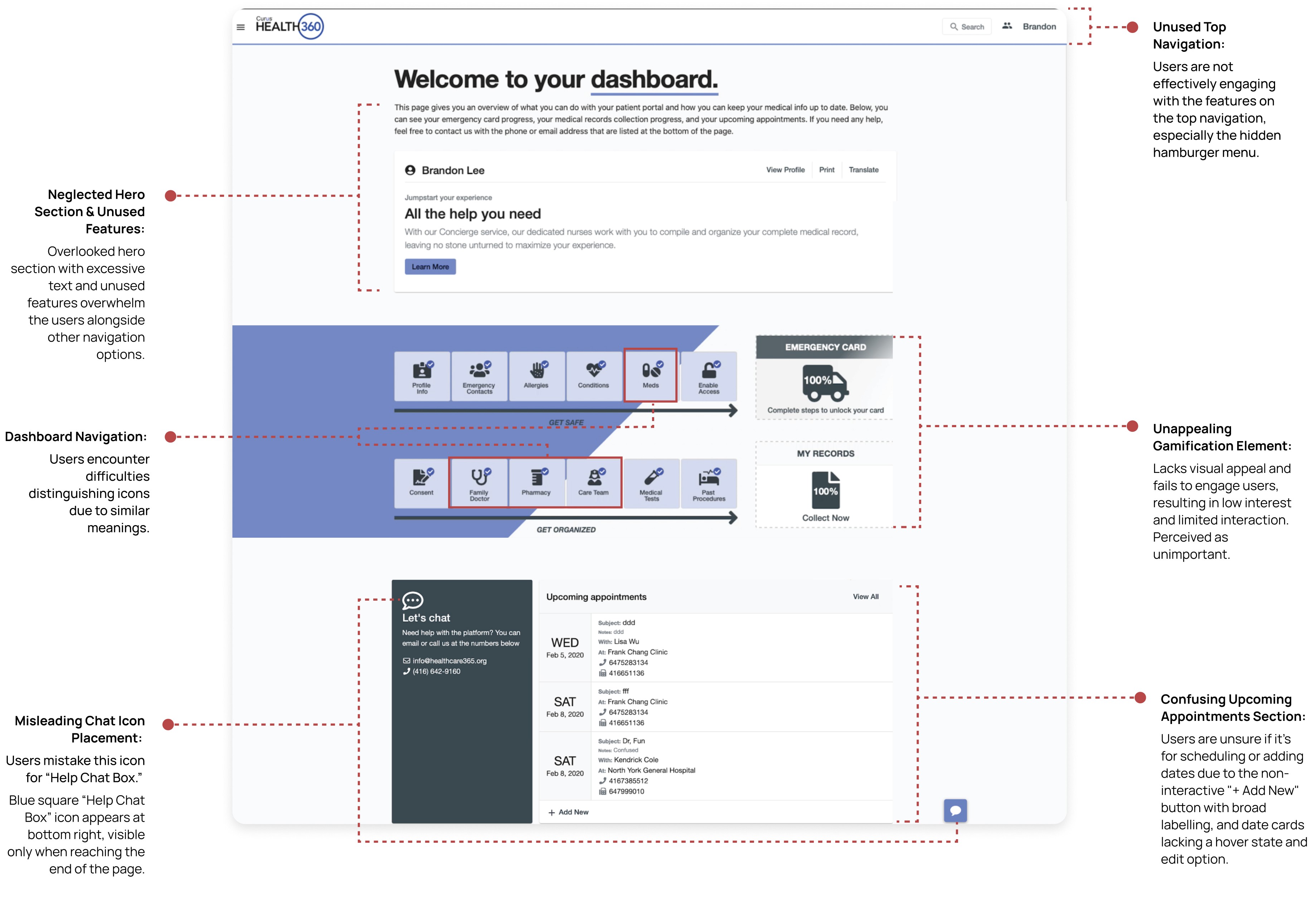
The Current Dashboard Experience (Before Screen)
Research
We divided the early stage of usability testing into 3 phases for a more comprehensive understanding of the user experience and to identify different issues that might be missed with a single method. This approach will also facilitate cross-data validation and provide a holistic understanding of the research findings.
O1
Heuristic Evaluation
O1
Assessing Severity of Usability
We evaluated the current experience against 12 usability heuristics. Identified worst offenders as a way to inform design strategy and direction.
Revealed critical usability issues:
1) Flexibility and efficiency.
2) Failure to provide documentation and help.
3) Inability for patients to recover from errors.
Quantifying Usability Issues

Severity Ranking of Top 5 Usability Issues

O2
Task Usability Test
O1
Optimizing Usability Breakdowns
8 participants performed 7 tasks in a 45-minute interview, evaluating the current experience.
Task completion time, success rate, and satisfaction rating were measured to determine overall usability. Findings inform prioritized enhancements for an optimized experience in the iteration phase.
Top experiential breakdowns:
1) Task 1: Make an appointment with their healthcare
professional. 100% participants COULD NOT make
an appointment.
2) Task 5: Find the Help Support Chat.
100% participants failed to find the help chatbox.
3) Task 6: Upload and view medical documents.
63% participants were uncertain about document
upload accuracy.
Task Overview & Details: Top Experiential Breakdowns

User Breakdown: Incomplete Task Rates

Only 1 in 8 participants achieve a high success rate to complete MOST tasks

O3
Card Sorting Exercise
O1
Optimizing Icons and Categories
Facilitated a collaborative workshop with 8 participants to improve information architecture by applying Miller's Law.
Simplify the primary navigation from 12 to 7 icon cards, addressing user categorization issues and preventing decision fatigue.
Top concerns from patient’s perspective:
1) Profile Info → My Health Profile
2) Upcoming Appointments → Appointments & Scheduling
3) Meds and Pharmacy → Medication & Prescription
4) Consent → Medical Documents
5) Chatbox → Help & Support
Categories Ranked From High To Low Priorities For Users

Analysis
We synthesized the collected data from the 3 methods into an affinity map to help form research insights and brainstorm design ideas to solve higher-order problems.
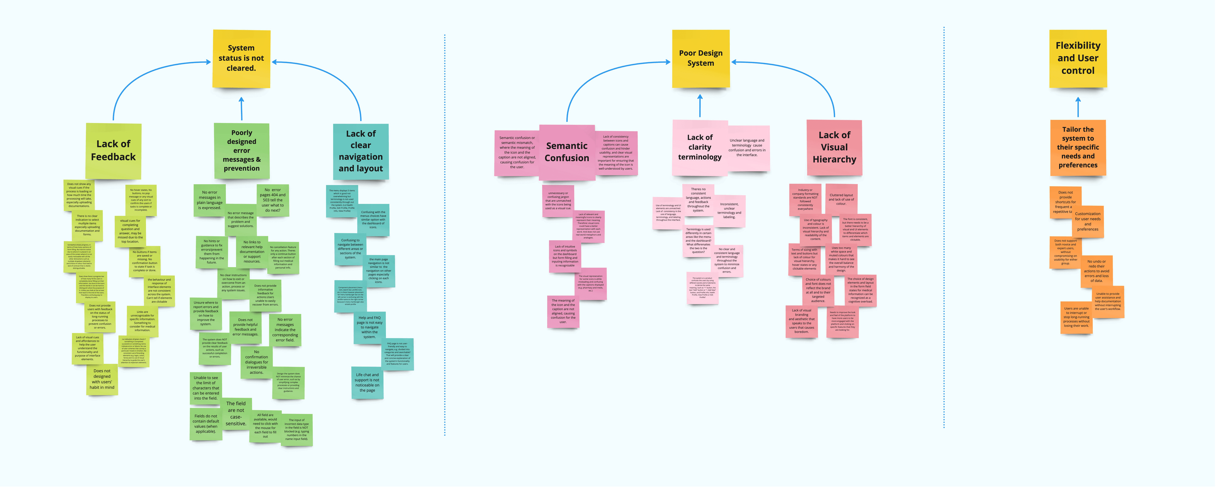
*click image to enlarge*
Research Insights (extracted from our affinity map above)

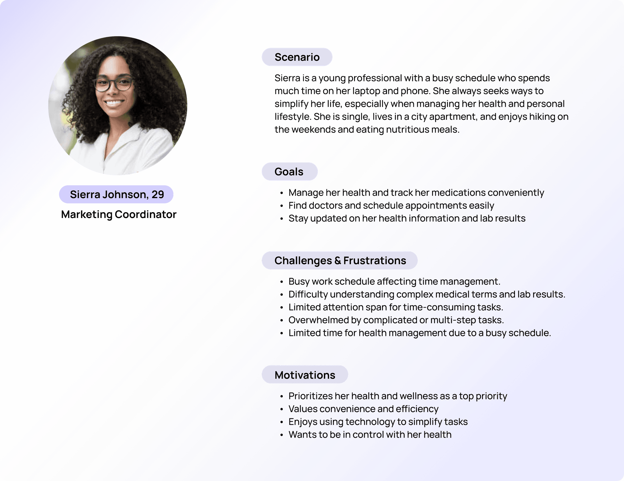
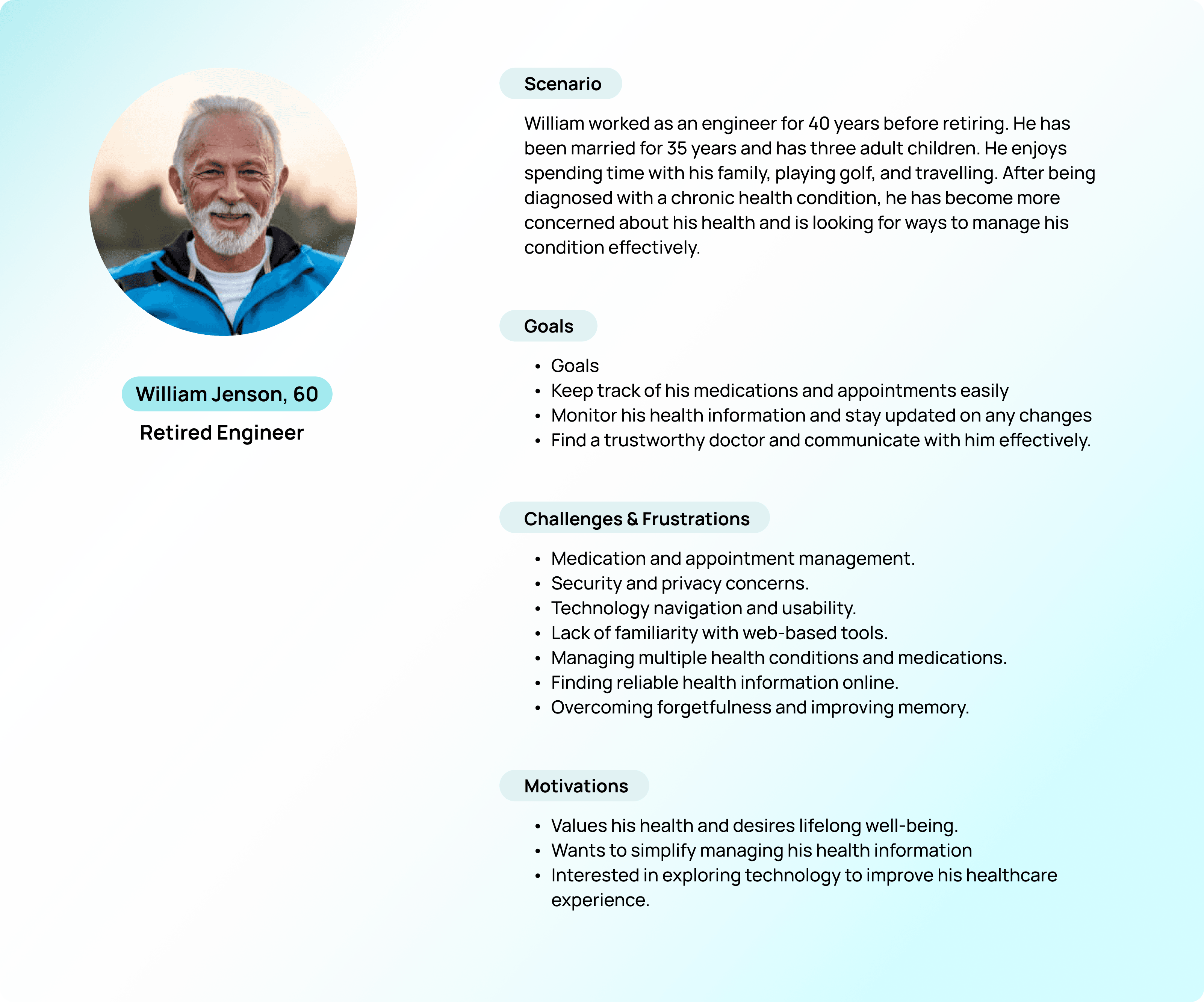
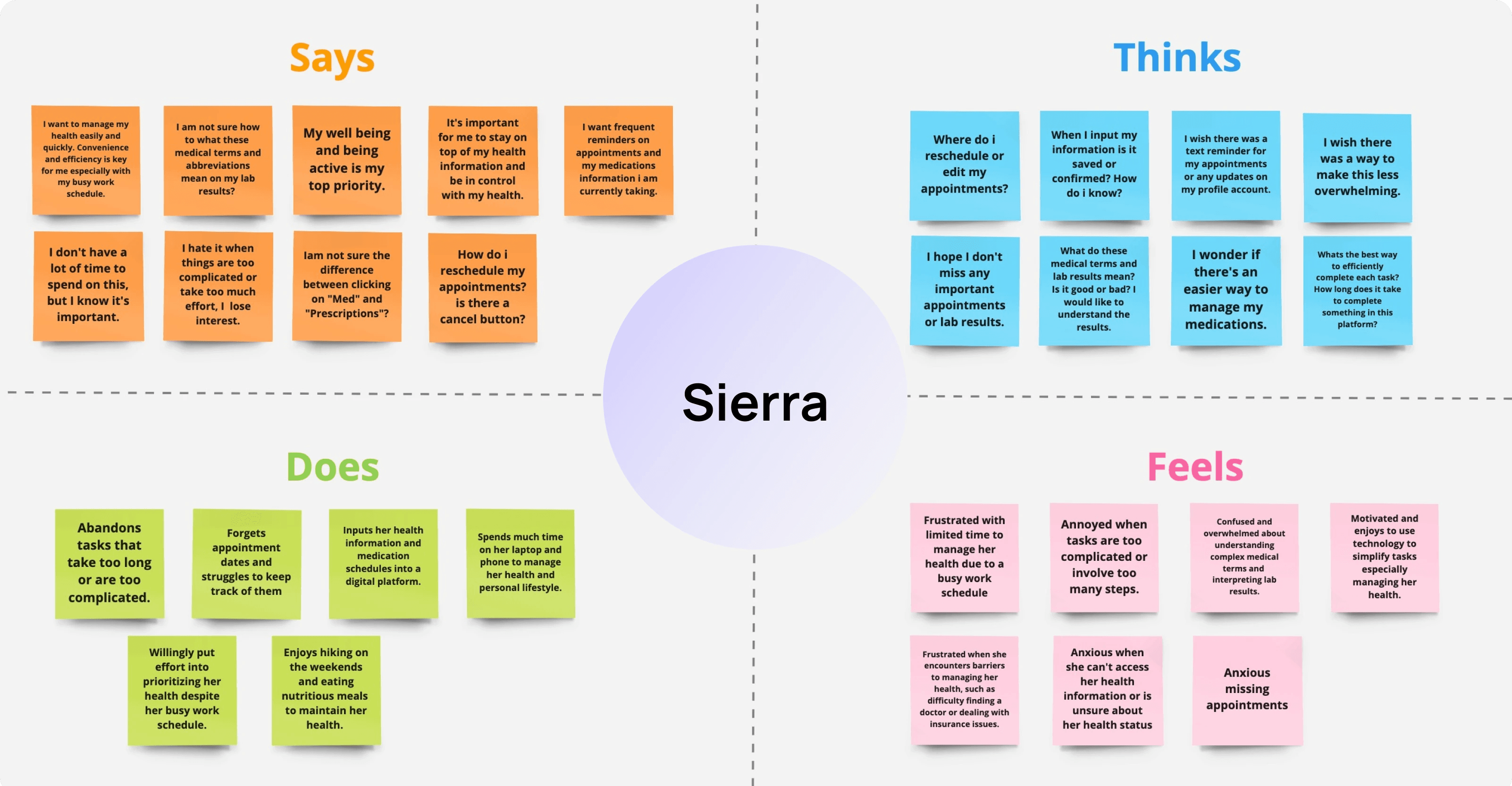
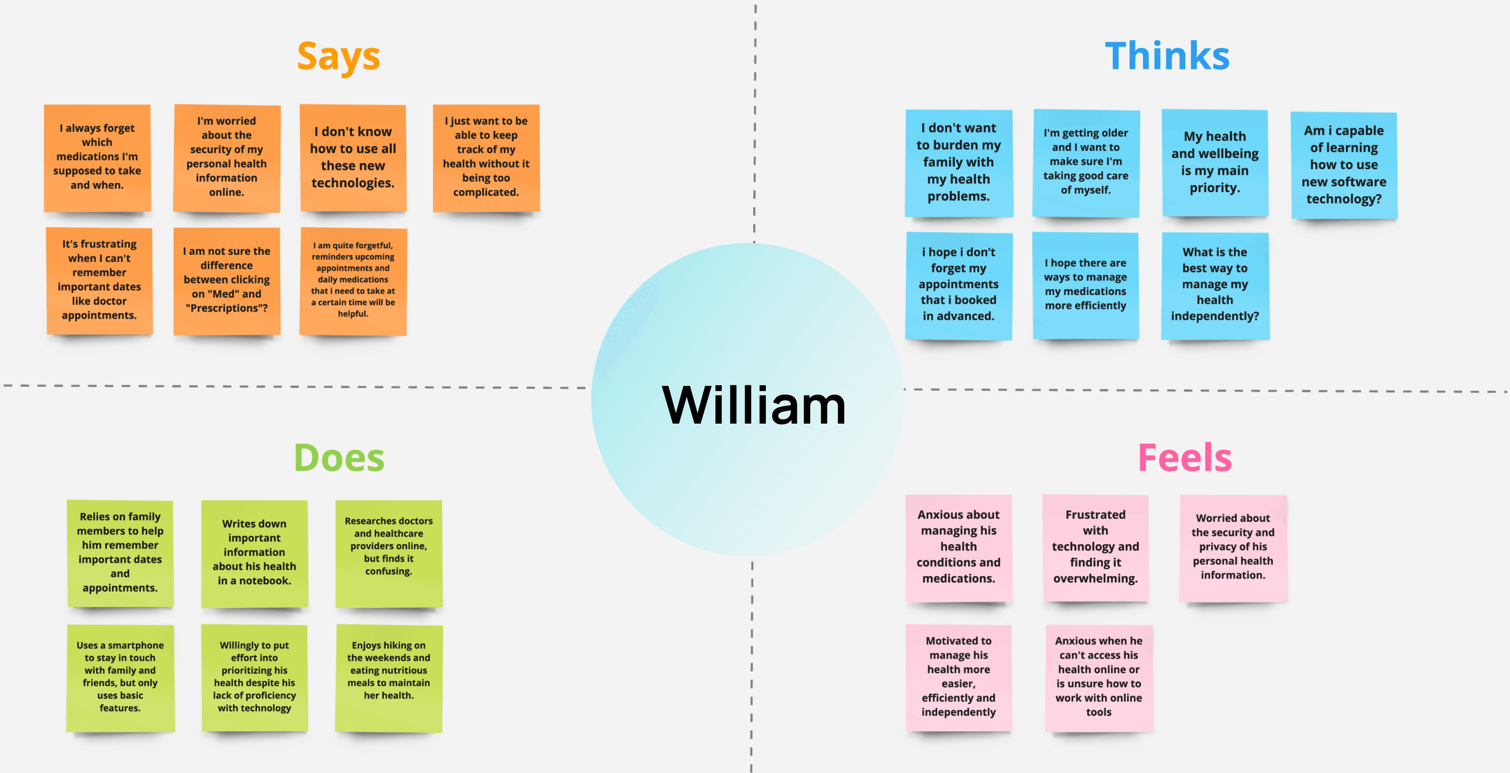
Users Representation
With users in mind, we developed personas for Gen Z/Millennials and Gen X/Baby Boomers based on extensive research. Empathy maps helped us grasp their unique needs and frustrations effectively.
Visualizing The System Structure
To better understand the structure and navigation flow of the system for our users, we created a information architecture. We listed necessary actions under each page to visualize the setup and facilitate the iteration of potential solutions.
*hover to interact with the board*

12 icons was a major problem. Reducing to 6 icons was necessary for clarity and efficient decision-making.
Modified Icons (After)
Final Version
Custom icons were chosen for brand alignment and universal visual language across diverse users, surpassing Material Design.
Crafting Memorable Icons
An icon is “worth a thousand words.”
Following the aphorism, “a picture is worth a thousand words,” redesigning the dashboard icons convey information and actions effectively, removing the semantic confusion.
Dashboard Icons (Before)

Key Learnings from Iteration 1
Importance of balancing creativity with user-centred design.
We became focused on being bold and unique in our design decisions during our first iteration, which led us to prioritize aesthetics and functionality for iteration 2. We identified design requirements for our team that met the needs of our users to move us forward for iteration 2.
Requirements for Iteration 2 (that we kept in mind)

Design Iteration 2
We reorganized and simplified the side navigation and dashboard layout based on high-priority categories from our users. This resulted in a user flow that empowers patients and caregivers to easily manage their health with clarity and simplicity compared to the first design we had.
With this low-fidelity iteration, we identified the following to
bring forward to our final design:
1. Layout & structure.
2. Navigation & hierarchy.
3. Colour palette & font choice.
4. Basic interaction elements.
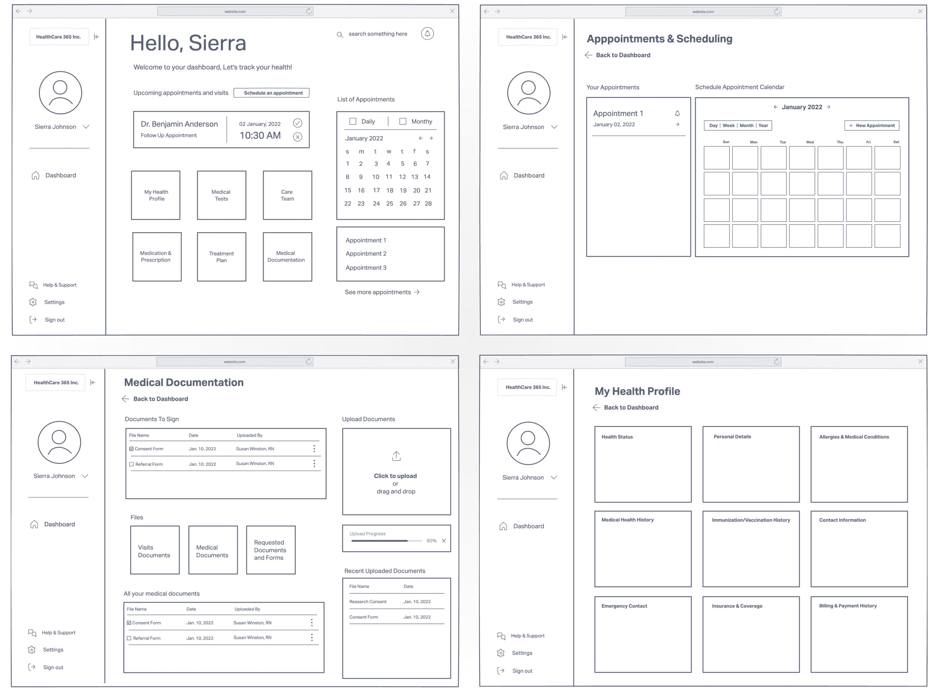
Final Solution
O1
Dashboard Homepage
O1
Sidebar and Iconic navigation:
To provide contextual awareness and structured layout for easy navigation through different sections.
Appointments reminders and scheduling:
Appointments are top priority for users, hence placed at the top hierarchy before the icons.

O2
Calendar Integration
O1
Managing Appointments:
A familiar and intuitive visual representation of time, making it easier to view and manage appointments within a specific date and time context.

O3
Medical Documents
O1
Handling Documents and Enabling Uploads:
Streamlining the workflow with documents between your medical providers and care team.

My Learnings 🌱
The opportunity to work with a real client was incredibly valuable, providing a hands-on and practical learning experience unlike any traditional class project. Embracing the lead role was initially daunting, as I doubted my abilities, but my professor's unwavering encouragement and belief in me empowered me to take charge. ✨✨ The key lessons I gained from this project are:
Balancing Tasks and Responsibilities: Managing multiple tasks and responsibilities effectively was a major challenge. I learned to prioritize and delegate tasks based on team members' strengths.
Balancing Strengths for Collaborative Harmony: Inclusivity was crucial for achieving efficient results. Listening to everyone's ideas and concerns helped leverage the team's strengths.
Aligning User Needs and Stakeholder Goals: Project scopes evolve, highlighting the need to consider various factors beyond user needs.
Being Insight-Driven: Through mentor guidance, I improved my storytelling by reducing unnecessary text and emphasizing important project points. Big Shoutout to Jackie Chow, Carice Chan & Habit Factory for their support.